Best Figma Icon Libraries in 2026
Figma has changed how designers collaborate, prototype, and ship digital interfaces. But when an individual designer or a design team searches for a Figma icon library, they are usually not looking for SVG files. They are looking for icons that work directly inside Figma as components, support variants, respect overrides, and scale naturally within a design system.
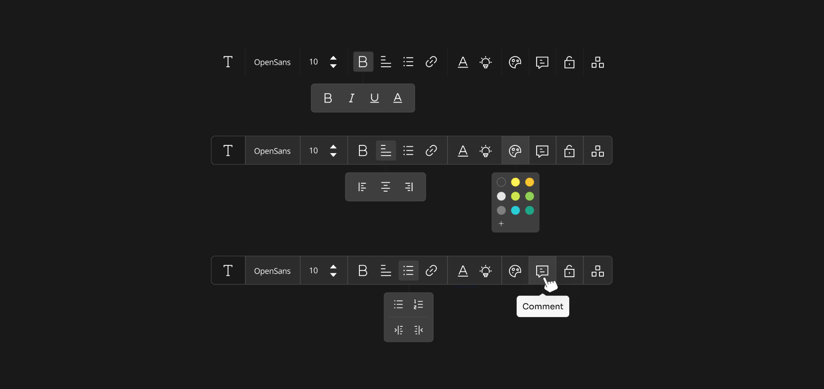
A true Figma icon library is built for Figma workflows, not simply exported into them. It allows designers to search icons easily, switch styles without breaking layouts, reuse components across files, and maintain visual consistency without manual cleanup.
In this guide, we’ve curated and reviewed some of the best Figma icon libraries, focusing on options that are component-based, design-system friendly, and built to work natively inside Figma. We’ll explain how these libraries differ, what each one is best suited for, and how to choose the right option for your specific design needs.
Best Figma Icon Libraries
Figma’s icon sets are renowned for their versatile vector graphics editing capabilities. These sets can be easily integrated into design systems and components within Figma projects. Among the popular libraries, the following stand out:
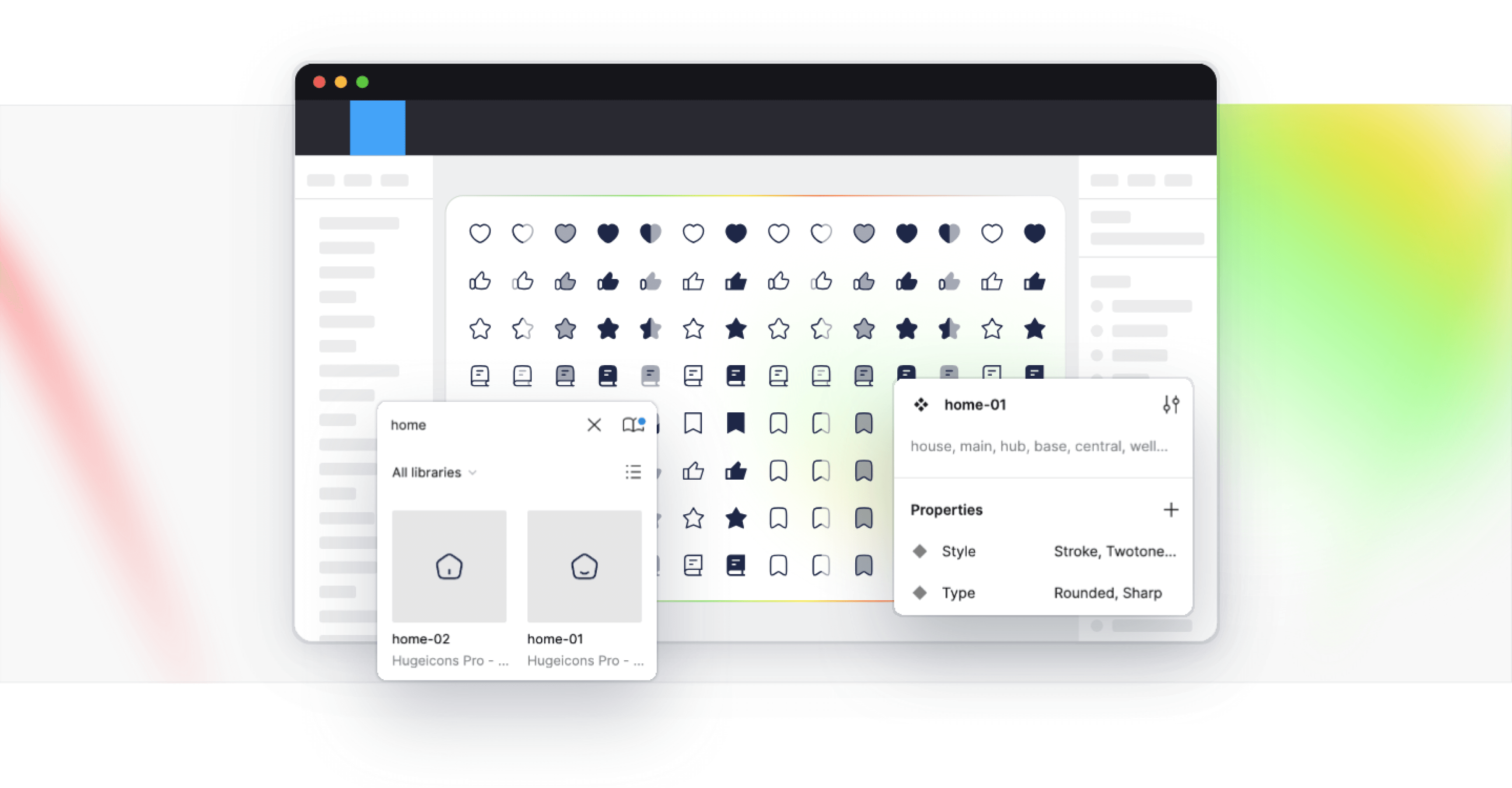
Hugeicons Figma Icon Library

In modern UI and UX design, visual consistency is an important decision. Well-designed interfaces rely on icons that feel balanced, scale cleanly, and stay visually aligned across every screen and component.
Hugeicons Figma Icon Library is a beautifully crafted icon system made in Figma, for Figma. Instead of exporting static SVGs, the icons are built as native Figma components and variants, allowing designers to work with them the same way they work with any other design system element.
With 46,000+ carefully designed vector icons across multiple styles and variants, Hugeicons supports both visual polish and system-level consistency. Icons can be resized, recolored, and swapped without breaking layouts, making the library well suited for design systems, SaaS products, and large UI libraries where aesthetics and structure matter equally.
Key Features
- 46,000+ icons across multiple UI-focused categories
- Built natively for Figma as components and variants
- Includes both outlined and editable-stroke versions
- Icons optimized for web and mobile interface design
- Figma plugin for searching and inserting icons
- Free tier available, with a larger Pro library for extended use
Pros
- Made for design system
- Native Figma workflow using components and variants
- Large icon collection with broad UI coverage
- Regular updates and additions
- Suitable for both individual designers and teams
Cons
- No noticeable cons
- Only available for lifetime users.
Access Tiers
Hugeicons supports the design community by offering both free and professional access.
- Hugeicons Free: Includes 4,600+ open-source stroke icons usable in personal and commercial projects.
- Hugeicons Pro: Unlocks the full library of 46,000+ icons across all 10 styles, featuring fully structured Figma components and variants.
Overall, Hugeicons is a solid option for designers who want a large, Figma-native icon library and prefer managing icons as part of their design system rather than handling standalone SVG assets.
Hugeicons also provides a Figma plugin for searching and inserting icons directly into designs, as well as a free tier with a limited set of stroke icons. A Premium version unlocks the full library and is aimed at larger products, SaaS interfaces, and design systems that need consistent icon coverage at scale.
Untitled UI Icons

Untitled UI Icons is a Figma-native icon library designed for UI and product design. The icons are built specifically for use inside Figma, with a focus on consistency, neutrality, and predictable behavior within component-based workflows.
The library includes 4,600+ icons, designed on a 24×24 grid with a default 2px stroke weight, which helps maintain visual balance across different sizes. Icons are delivered as Figma components and support color and stroke overrides, making them suitable for use in shared design systems and reusable UI libraries.
Untitled UI Icons offers multiple visual styles, including line, solid, duotone, and duocolor options. Designers can switch between styles while maintaining consistency, which is useful when adapting icons to different interface contexts.
A free version is available with 1,100+ line icons, suitable for basic UI needs and small projects. Paid plans unlock the full icon library, additional styles, editable master icons and SVG exports.
Pros
- Clean, neutral icon style suitable for modern UI and SaaS products
- Built 100% natively for Figma components and overrides
- Consistent grid and stroke system
- Free tier available for basic use
Cons
- Smaller icon count compared to large-scale icon libraries
- Limited stylistic range beyond core UI-focused styles
Untitled UI Icons is a good fit for designers and teams who prefer a curated, Figma-first icon set with predictable behavior and straightforward licensing, rather than a very large or highly decorative icon library.
Pikaicons

Pikaicons is an icon library created with a more expressive and character-driven approach to UI design. Instead of aiming for strict neutrality, the icons lean toward a rounded, friendly, and slightly playful aesthetic that helps interfaces feel more approachable.
The library includes 4,000+ icons spread across multiple visual styles such as Stroke, Solid, Contrast, Duo Stroke, and Duo Solid. Icons are designed on a consistent grid with a 2px stroke baseline, ensuring clarity while still allowing room for personality in the shapes and curves.
A notable aspect of Pikaicons is its community-driven growth model. The library expands through regular updates, and users can request new icons to cover emerging needs or niche use cases. Licensing follows a pay-once model, offering lifetime access and updates, with both free and paid options available.
Pros
- Friendly, rounded icon style with strong visual character
- Multiple stylistic options within the same library
- Clean SVG exports suitable for production
- Lifetime license with ongoing updates
- Custom icon requests supported
Cons
- Smaller icon count compared to large system-focused libraries
Pikaicons is best suited for designers who want icons that add warmth and personality to interfaces, particularly in consumer apps, creative products, or modern web experiences.
Coolicons

Coolicons is a clean, simplicity-driven icon library designed with a strong focus on visual consistency and practical UI use. The library is intentionally restrained in scope, prioritizing clarity, balance, and predictability over volume or expressive styling.
The core library includes 440+ open-source icons, while Coolicons Pro expands the set to 1,320+ icons. All icons are designed on a consistent grid with a 2px stroke, making them well suited for web, application, and mobile interfaces where uniformity matters.
Coolicons is built in Figma and for Figma, with icons delivered as components that respect stroke and color overrides. The Pro version adds support for variants, live corners, and duotone/duocolor styles, allowing designers to adjust stroke weight or corner radius without rebuilding icons.
Pros
- Clean, minimal icon style with strong visual consistency
- Built in Figma with proper component and override support
- SVGs optimized for production use
- React component library available
- Open-source free version
- Pro version adds variants, duotone, and live corner control
Cons
- Smaller icon set compared to large-scale libraries
- Limited stylistic range by design
- Visual language may feel too restrained for expressive or brand-heavy UIs
- Fewer categories than larger, system-focused icon libraries
Material Design Icons

Material Design Icons is the official icon library maintained by Google, built to support the Material Design system across web, Android, and product interfaces. The icons are designed around Google’s Material Design guidelines, focusing on clarity, consistency, and predictable behavior across platforms.
The library includes 2,000+ icons, available in five styles: Filled, Outlined, Rounded, Sharp, and Two-tone. Each icon follows Material Design’s core metrics and spacing rules, ensuring visual consistency when used alongside other Material components.
For Figma users, Material Design Icons are provided as Figma components with variant support, allowing designers to switch styles directly from the properties panel. Icons are also tagged with keywords, making them easy to search and reuse from the Assets panel.
Material Design Icons are free to use and distributed under the Apache License 2.0, making them suitable for both personal and commercial projects. The library is commonly used in Google-style interfaces, Android apps, and products that closely follow Material Design principles.
Pros
- Official Google-maintained icon library
- Fully aligned with Material Design guidelines
- Multiple styles with consistent metrics
- Free for commercial use under Apache 2.0
- Available as Figma components with variants
Cons
- Visual style is tightly coupled to Material Design
- Less flexibility for non-Material or custom brand aesthetics
- Smaller icon set compared to very large UI icon libraries
- Last updated 3 years ago
Material Design Icons are best suited for teams and products that adopt Material Design as a system, particularly Android apps and Google-inspired interfaces where consistency with Material components is a priority.
Summary
In conclusion, choosing the right icon library is a crucial step in the design process. Whether you’re looking for a comprehensive collection, a minimalist design, or a unique aesthetic, there’s an icon library out there that fits your needs.
By considering factors such as project requirements, brand identity, and budget, you can make an informed choice that will enhance your design project and improve the user experience. Remember, a well-chosen icon set is more than just decorative embellishments; it’s a crucial component of the user interface that can make or break your design.
Frequently Asked Questions
What are some of the best Figma icon libraries in 2026?
In 2026, some of the best Figma icon libraries are Hugeicons, Untitled UI Icons, Pikaicons, Coolicons, and Material Design Icons.
How do I choose the right icon library for my project?
Consider the project's requirements, brand identity, and budget when choosing an icon library. Ensure the library offers regular updates and accessible formats for long-term use.
What is the importance of style diversity in an icon set?
Style diversity in an icon set is important as it allows for space for flexibility and adaptation to various design themes, enhancing the user experience by providing visually appealing icons that cater to different design needs.
How does an icon set contribute to the user experience?
An icon set contributes to the user experience by providing visual cues for navigation, enhancing aesthetic appeal, adding, and improving engagement and satisfaction. This makes it easier for users to interact with the interface and enhances the overall experience.
Is it better to invest in a high-quality icon library or use free resources?
It is better to invest in a high-quality icon library if your project requires comprehensive collections, regular updates, and better support, as this can improve the project's overall quality of life and save time.
Related Posts
5 Lucide Icons Alternatives That Offer Better Icons
Lucide has become one of the most recognizable icon libraries in the modern React ecosystem. It’s open source, lightweight, easy to install, and...

![Icon Design Guidelines: How to Design Beautiful Icons [+Resources]](https://cdn.hugeicons.com/blog/1742968097525-First preview final.png)
Icon Design Guidelines: How to Design Beautiful Icons [+Resources]
Over the years, we’ve designed more than 46,000 icons. Based on this, we’ve compiled a set of guidelines based on our knowledge. This article will...
Top 13 UI UX Design Icon Sets in 2026
Deciding on a icon library? Our expert roundup of the top icon sets for 2026 cuts through the clutter, focusing on standout features, diversity...
Best Figma Plugin for Icons: Top 10 Outstanding Choices in 2026
Icons might seem like small details, but they’re actually central to great design. They simplify complex ideas, enhance visual appeal, and guide...
12 Best SVG Icon Libraries to Use in 2026
SVG icon libraries are collections of Scalable Vector Graphic icons that bring precision and flair to websites, apps, and projects. The unique...
.png)
15 Best Free Fonts for UI Designers in 2026
Fonts are essential in UI design, significantly influencing user interaction. Beyond mere availability, selecting the right fonts is crucial, as...