Icon Design Guidelines: How to Design Beautiful Icons [+Resources]
![Icon Design Guidelines: How to Design Beautiful Icons [+Resources]](https://cdn.hugeicons.com/blog/1742968097525-First preview final.png)
Over the years, we’ve designed more than 46,000 icons. Based on this, we’ve compiled a set of guidelines based on our knowledge. This article will guide you through the importance and use-cases of icons, resources, and the know-hows of designing icons following the right principles, guidelines, and tools.
Whether it’s a web browser or a keyboard, icons simply help you navigate through the interface with recognizable graphical symbols that represent different functionalities.
Imagine a keyboard without any icons, wait! Let us visualize that for you–

See how much of a hassle that would be for an average user to use a simple device without any icon?
Well designed Icons make it easier for users to operate, and navigate machineries and virtual interfaces like websites, apps and mobile devices.
Designing a simple, yet functional icon however, is not a simple task at all. So many beginners, or even professional UX designers get clueless when they’re asked for a straightforward answer on how to design an icon?
Well, if you’re someone who has asked this question, you’re the one who we’ve written this blog for!
This guide will cover these topics divided into various sub-topics, so you can get started on designing your first set of icons. In this blog you’ll learn:
- The basics of icons and icon designing
- The importance of using the right icons
- How to start designing icons
Later on, we’ll provide a list of the best icon resources available online
Let’s dive into the world of Icons!
Understanding Icons: What is an Icon?
Originating from the Greek word eikōn, the word Icon means image or likeness. First recorded to be used in the religious context, from a design perspective, an icon is a visual element that represents certain functionalities in the graphical user interfaces (GUIs) through small images or designs.
For example, the main sections of a website is often depicted with simplistic graphical icons like this Hugeicons example here–

Difference Between Logo and Icons
Icons and logos are often confused for each other because of some of their overlapping characteristics. But to their core they differ a lot! Let’s dissect.
Logos are unique symbols that carry a brand identity through itself. It’s a flag bearer of the brand that it represents. Logos help create a brand identity so anyone can instantly recognize a brand upon seeing its logo.
Two brands ideally should not use identical logos, because one might get confused for the other. Although unethical, bootleg brands use it as a malpractice to scam people and/or to attract them.
Apple’s bitten apple, Microsoft’s iconic Windows design are some of the prolific examples of a logo. It’s best to use vector-based design for these, as logos need to be used in a number of places in different sizes.
Icons on the contrary, are small graphical elements that are more general and universal in functionality. Icons are used to help users navigate through an interface, both physical and virtual. Like an envelope icon (✉️) used for emails, or a paperclip icon (📎) for attachments.
An example makes it clearer, let’s take a look–

In this example, the same swoosh, which is the logo for the renowned American apparel brand Nike, is a globally recognized icon for correct or indication that something is done.
Why Should You Choose The Right Icon?
One day, I was using my brother’s Nokia phone (one of the og one’s) and accidentally changed the phone language and the phone reset to the home screen and I didn’t know a word of the phone’s current language!
A sudden rush of cold shivers raced through my spine as I thought about the consequences of this mistake (It’d be dire!).
Luckily, the phone had a great UI with relevant and easy to understand icons throughout the system which helped me navigate through the phone’s language settings without even knowing the language and change it back to English easily without my brother knowing the whole shenanigan!
So, a great set of icons essentially helped me from being doomed for a rookie mistake I made. And trust me, even the most professional guys make mistakes that cost them a fair share of precious time.
If that story tells us anything it’s that, we should choose icons that can be helpful, even to the most basic of users while designing an UI if you want to provide a great user experience.
How to Start Designing Icons?
Before you open up your designing software and start putting up strokes, there are some guidelines you need to follow and some prerequisites you need to fill. That is, if you want the icon to be, well, iconic.
In this section of the blog, we’ll go through the process of how to design an icon from start to finish. We’ll share some theoretical as well as some technical knowledge, but we're gonna try to make it as simple as we can.
Here we go!
Decide what you’re trying to say with your Icon
Each one of the Icons in the Icon set you’re designing should serve a purpose. You need to find out what functionalities and actions you need to convey through the icons and make a mental sketch of the icons needed for the functions.
Depending on the type of site you’re designing, you’ll need to design some specific icons related to the niche, like an “Add to Cart" button for ecommerce websites; along with some must-needed icons that every kind of site makes use of, like the home button or the notification icon.
Once you decide the purpose of the icons, you can proceed with the next steps.
Look at what’s trending
Icons are all about trends. Trends dictate how people prefer icons to look and function like. Many icons get invented as technology evolves. For example, the AI icon is a thing now despite it being a rare sight as an icon even a few years ago.
Much like every other trend, design trends tend to go through changes over time. Trends are even faster-paced these days and you need to keep up with the changes or else your users might deem your icons to be outdated and poorly designed, which can harm the overall user experience.
Follow your favorite designer in social media and browse trendy websites and icon repositories like Hugeicons to get an idea on what's trending!
Choose the type and style of your icon set
There are a number of ways you can design an icon. Many types and styles you can choose from. Your icon type and style might be one of the main selling points of your icons.
There are a plethora of types and styles in icon designing. Our advice would be to try and explore each of the icon types and styles; see which one of the icon types or styles matches your specific needs.
Or you can go on and innovate a new icon style, like Google’s material icons; or Microsoft’s flat icons. Go where your innate innovation takes you.
Below are some of the icon styles our expert designers designed icons in at Hugeicons—

Find design inspiration
Icons are often universal symbols that need to speak to the users no matter what their language is. So, how do you speak to a global audience using only design?
The answer simply lies in everyday objects people all over the world see and use. Like this simple Hugeicons design—

This demonstration shows how we designed a simple yet meaningful alarm icon, inspired by a real alarm clock we know and use globally.
It also helps to look for inspirations from known icon repositories like Hugeicons. You can find out more about icons that already work for most use-cases and make your own tweaks to them to design the perfect icon.
Now, what if you wanted to design something so niche, complex and nuanced that you fail to find reference from obvious sources?
You look for a similar reference in nature or a metaphor that can be linked to the specific action you want to convey through your icon. Avoid vague metaphors and obscure references lest you confuse or risk misleading potential users.
Pick up a design tool
When you’ve finally got all the theoretics outta the way, now it’s time to get to work. And the first step towards that is picking up your design tool.
A design tool can be as basic as a pen and paper and as advanced as software tools like Adobe Illustrator and Figma. Although if you wanna use a hand-drawn icon, you have to digitize it with the help of said softwares.
Open up your ideal design software and get to work!
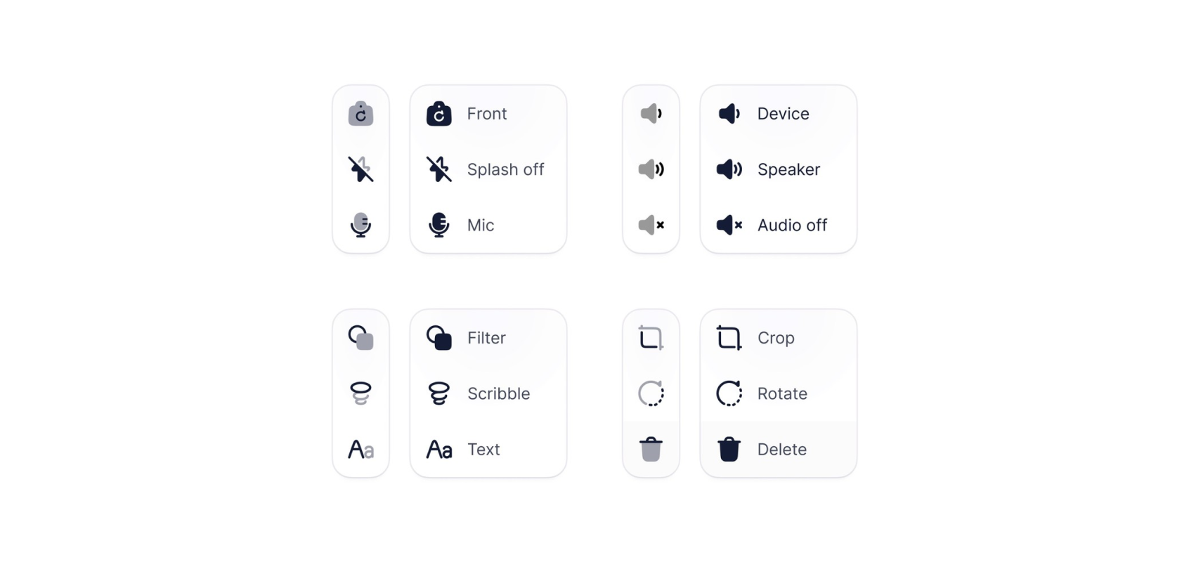
Go for a simpler design
Icons need to be easily recognizable. Even at smaller sizes. Intricate details seem to be lost in those sizes. You might be designing your icons at 3200% zoom but your end product might end up being a tiny 16 × 16 component.
As icons often tend to be small in size, finer details start to become unnoticeable to the human eye. Moreover, the extra details only add redundancy to the point the icon starts to look too jammed, thus becoming incomprehensible.
This is the primary reason you have to be as simplistic and minimalistic as you can while designing an icon. This demonstration below makes it clear that simpler designs just work better as icons, let’s have a look—

Use grids and Keylines for accuracy
The human brain can recognize misalignment and inaccuracy even in objects as small as an icon, through its pattern recognition. Which is more the reason to use the grid and keylines while designing icons. Although the main reason for using grids and keyline would be to maintain uniformity and consistency in the final design.

For starters, we’ll start with a 24 × 24 grid. The best practice is to keep a 2px padding area in the outermost edges of the grid and a live area consisting of the rest of the 20px for your actual icon.

The functionality for the padding area is to provide a breathing space for the design. It’s best to avoid putting any design elements outside the live area and into the padding. The only instances it’d be okay to break the rule is to maintain uniformity of the icon and make it stand on its own.
When it comes to rules vs. creativity however, we’d advise you to break the rules for the sake of an unique design.
Aim for visual consistency
Icons often come as a set. You might sometimes need to design a one-off icon but even that has to be a part of another set of icons. Word of advice: follow the exact style of the icons it will eventually be a part of.
Once you’ve chosen a type or style for your icons, you should stick to the same type and style while designing the whole set. Otherwise, your icons will end up looking out of place; yet all over the place and aesthetically unpleasant.
Let’s go through a set of guidelines that will help you keep the most important part of an icon set consistency.
- Use decimals: Make the X and Y coordinates (vertical and horizontal positioning) of the icons whole numbers (e.g 0, 24) not decimals (-0.03, 24.4). Using decimals will result in distortions and blurriness in the icons due to the coordinates not lining up with the pixels.

- Maintain uniformity: Keep the stroke thickness, corner rounding, and color palette the exact same in all your icons, so as to remain consistent.

- Grid sizes: Stick with the standard grid sizes. 16 x 16px, 18 x 18px, 20 x 20px, or 24 x 24px are standard grid sizes. Choosing from these grid sizes makes the alignment straightforward later on and it’s easier to fit them in a canvas. Open up a 100% view of the icon to get the idea of how the final icon would look like.
- Stroke weights: You should keep stroke weight the same across the icon set. Although you should decide whether to keep the weights thinner or heavier after looking at your overall UI design.
- Reuse shapes: Always reuse shapes like rectangles, arrows, circles etc. you designed previously instead of always designing them from scratch. It saves you precious time and results in uniformity across your icon set.
With the fear of sounding like a broken record, we’d still say consistency is the key in icon designing. You cannot please your users with an inconsistent set of icons. A set of homogenous icons are the most pleasing, aesthetically talking.
Add your own flair
There are a ton of icons and icon packs available online. Most people can find the icons they’re looking for within an hour’s research.
Which begs the question; why would someone choose to use your icons over thousand others?
I put this question through one of the most prolific UI/UX designers Masum Parvej.
“Mostly for beauty”, Masum said.
This further strengthens our statement that aesthetic uniqueness is one of the most important factors in icon designing.
You won’t be able to get to the point of uniqueness overnight though. It takes a great amount of time, effort, dedication and rigorous practice to get to the point and that’s when you gather enough knowledge to make a design as simple as an icon recognizable and stand on its own.
Practice and recreate
There isn’t a shortcut in the way of success, the way to perfecting any skill can only be achieved through rigorous and continuous practice. Sure, talent plays a role, being interested in something is the foremost condition of perfection, but to excel at something; you need to practice extensively.
Start by following tutorials, gather and apply tips from thought leaders and individual creators. Recreate icons from prominent sources that seem to just work well for their intended purpose and provide great user experience.
Remember, practice makes perfect.
So, take your machine out, follow our guide and start designing an icon set!
Test and gather feedback
You’ve followed every little detail and finally finished designing your icon pack. You’d guess your work is finished and you can now start selling or submit your icons to your clients. But a crucial task still remains— testing your icons!
It’s an important task because it essentially answers you the question– does your icon work? If the answer is yes, your icon is production-ready, but if it’s a no, then you need to gather feedback and fix, or rework your icons.
Export the icon files in the format your developers or client prefer and tell them to implement the icons in the intended software. From there, you can call up your beta testers or even colleagues and friends what each icon they think conveys.
Take their feedback and if there are any places for improvement, aim for it. Even if some icons need redesign, go for it. For the most part, keep an open mind while receiving feedback or even criticism of all kinds and always aim for betterment.
All in all, it all boils down to following and implementing a few design principles, some best practices and a bit of willpower to start designing your first icon.
As an amateur designer, this is how your icon designing journey should start—
- Decide what you’re trying to say with your icon
- Look at what’s trending
- Choose the style and type of your icon set
- Find design inspiration
- Pick up a design tool
- Go for a simpler design
- Use grids and keylines for accuracy
- Aim for visual consistency
- Add your own flair
- Practice and recreate
- Test and gather feedback
Those were some genuine pieces of advice that will hopefully help you design your first icon and get you to fall in love with design, which is a prerequisite of being a great designer.
Best Icon Resources
If you’re looking for an icon resource for your website, you’ll find it very difficult to choose one from so many options available to you. Sadly, most of them are all show and no work! They might look good, but fail to communicate a functionality; or they're functional, but look rough and outdated.
Here, we compiled some of the best icon resources for you to choose from so you get the best of both worlds, namely looks and functionality! Let’s take a look—
1. Hugeicons
Hugeicons is a complete, all-inclusive icon library which offers 4,600+ free icons for designers and developers. With its premium version
Designed by specialist UX designers following all the best practices and design principles, this icon resource proffers and HQ of high-quality vector designs well suited for all device types including web, mobile, PCs, and print projects.
The free icon resource is being continually updated and improved upon by a dedicated design team. On top of that, it features an extensive range of icons you can customize to your liking and tailor them to fit your specific needs.
Hugeicons has an icon library consisting of 46,000+ icons spanning over 59 categories and 10 different styles, including tons of free options ranging from basic UI elements to icons suited for specific niches.
2. Material design
Material design is Google’s own open-source icon repo with an extensive collection of icons which encompasses a wide range of functionalities including alert, action, toggles, audio, video, notifications etc. They also provide guidelines denoting how to use the icons and the ability to integrate and export the icons to figma.
3. Streamline icons
Streamline icons offers over 30,000 icons starting from 14px to 24px in grid sizes. They have free “essential” icons that include basic icons and they offer a “full access” package for $29/ per month as well as two other paid plans. You can also buy lifetime access to individual icon packs too.
What’s Stopping You to Start Designing!
Icons are precise, artistic expressions of different functions. They are small in sizes, but the purpose they serve is not anything short of absolute necessity. A great portion of the user experience essentially depends on a great set of icons, which is enough reason for a designer to put extra effort on designing an icon.
We tried to mainly help designers who are stuck in a plateau of design quality and tried to show them the ropes of designing icons.
If you’re a beginner, or an expert UX designer, start designing icons using these best practices and remember— your icons should be practical first, with a touch of excellence on the design front.
Related Posts
5 Lucide Icons Alternatives That Offer Better Icons
Lucide has become one of the most recognizable icon libraries in the modern React ecosystem. It’s open source, lightweight, easy to install, and...

Top 13 UI UX Design Icon Sets in 2026
Deciding on a icon library? Our expert roundup of the top icon sets for 2026 cuts through the clutter, focusing on standout features, diversity...
Best Figma Plugin for Icons: Top 10 Outstanding Choices in 2026
Icons might seem like small details, but they’re actually central to great design. They simplify complex ideas, enhance visual appeal, and guide...
Best Figma Icon Libraries in 2026
Figma has changed how designers collaborate, prototype, and ship digital interfaces. But when an individual designer or a design team searches for...
12 Best SVG Icon Libraries to Use in 2026
SVG icon libraries are collections of Scalable Vector Graphic icons that bring precision and flair to websites, apps, and projects. The unique...
.png)
15 Best Free Fonts for UI Designers in 2026
Fonts are essential in UI design, significantly influencing user interaction. Beyond mere availability, selecting the right fonts is crucial, as...