Top 8 React Icon Libraries for 2026
Choosing a React icon library in 2026 is no longer about “how many icons it has.” It’s about how beautiful and consistent your icons are, how efficient they are in your bundle, and how easy they are to maintain long term as your product scales.
In the AI era, building interfaces has become easier than ever. With AI-assisted IDEs, vibe-coding tools, and auto-generated UI components, many teams can ship screens fast. But that speed comes with a downside: most AI-generated interfaces look the same.
When layouts, components, and patterns are increasingly standardized, visual quality becomes the differentiator. Icons are no longer just decorative elements. They are a core part of the UI language that communicates clarity, hierarchy, and trust at a glance.
Beautiful, modern, and consistent icons reduce cognitive load and make complex interfaces feel approachable, especially in AI-heavy dashboards where users scan more than they read. Teams that invest in thoughtful iconography create interfaces that feel intentional and premium, instead of generic and auto-generated.
Why Icons Matter in Modern React Applications
If you’re searching for a React icon library in 2026, you already understand the basics. The real question isn’t whether to use icons, but which library actually holds up in production.
In modern React applications, icons directly influence:
- How quickly users understand actions and navigation
- How clean and scannable dense interfaces feel
- How consistent the UI remains as the design system scales
- How trustworthy and polished the product feels overall
This matters even more in complex products like dashboards, internal tools, and AI-driven interfaces, where clarity and consistency directly affect usability. Poorly designed or mismatched icons make an interface feel noisy and unreliable, regardless of how good the underlying functionality is.
That’s why choosing a React icon library today is a design-system decision, not just an asset choice.
With that context in mind, let’s look at the best React icon libraries in 2026, and where each one fits best.
1. Hugeicons
![]() Hugeicons offers beautiful, production-ready icons for React projects. With 46,000+ icons in 10 styles, including 4,600+ free icons (Open Source) in stroke-rounded style, it covers almost every use case, letting teams build large applications without mixing multiple libraries.
Hugeicons offers beautiful, production-ready icons for React projects. With 46,000+ icons in 10 styles, including 4,600+ free icons (Open Source) in stroke-rounded style, it covers almost every use case, letting teams build large applications without mixing multiple libraries.
The library works especially well for modern SaaS products, professional dashboards, admin panels, AI-driven interfaces, and design-driven web or mobile apps, where visual consistency and polish directly impact perceived quality.
Trusted by Industry Leaders: Hugeicons is the preferred choice for high-stakes projects, used by elite teams including YC (Y Combinator), Fiverr, the Saudi Government, and popular developers worldwide.
Key features
- 4,600+ free icons in stroke-rounded style (Open Source)
- 46,000+ pro icons across 10 styles
- Hugeicons MCP server for fast, AI Agentic coding environment
- Migration tool (Migrate from another react icon library)
- Tree-shakable React components for better performance
- Consistent 24px grid, spacing, and stroke
- Easy customization for size, color, and stroke
- Works seamlessly with TypeScript and modern React tools
Why choose Hugeicons
- The most beautiful, up-to-date and consistent react icon library
- Maintains visual consistency across large apps
- Reduces bundle size by importing only used icons
- Scales for long-term React projects
- Eliminates the need to combine multiple icon libraries
2. Lucide React
![]() Lucide is widely known as the open-source continuation of the Feather icon ecosystem. It focuses on simple, stroke-based icons that are easy to recognize and safe to use across almost any type of product.
Lucide is widely known as the open-source continuation of the Feather icon ecosystem. It focuses on simple, stroke-based icons that are easy to recognize and safe to use across almost any type of product.
Many developers choose Lucide not because it is visually expressive, but because it is free, predictable, and widely adopted. The icons are neutral enough to fit dashboards, internal tools, SaaS apps, and open-source projects without drawing attention to themselves.
Lucide works well when teams want a standard icon set that “just works”, without licensing concerns or heavy customization requirements.
Key features
- Free and open-source with a permissive license
- Simple, familiar icon shapes used across many products
- Good tree-shaking and small bundle impact
- Straightforward React and TypeScript support
- Actively maintained and stable
3. Font Awesome React
![]() Font Awesome is one of the most widely used icon libraries on the web, known for its large icon catalog and strong brand and social icon coverage. It has been a default choice for many developers for years and remains familiar across a wide range of React projects.
Font Awesome is one of the most widely used icon libraries on the web, known for its large icon catalog and strong brand and social icon coverage. It has been a default choice for many developers for years and remains familiar across a wide range of React projects.
At its core, Font Awesome is designed as an icon toolkit, not a tightly controlled design system. Icons are delivered primarily as SVGs or web-font-based assets and are highly customizable through CSS for size, color, and basic animations. This flexibility makes it easy to integrate, especially in projects that prioritize speed and broad icon availability.
Because Font Awesome supports multiple delivery formats and a wide range of styles, teams often rely on it for legacy systems, enterprise apps, and interfaces where recognizable brand icons are essential.
Key features
- Very large icon catalog, including extensive brand and logo icons
- Supports SVG icons, web fonts, CDN kits, and npm packages
- CSS-based customization for size, color, and simple effects
- Free and Pro icon sets with multiple visual styles
- Strong documentation and long-term ecosystem stability
4. Heroicons

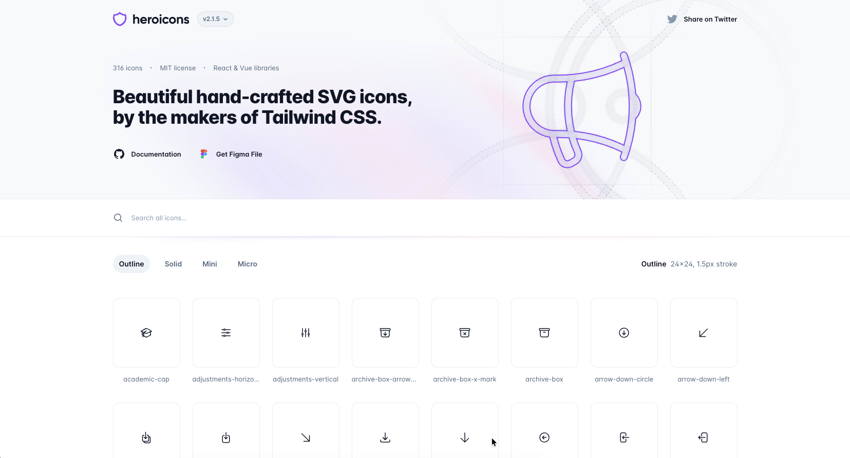
Heroicons is the official icon library from the team behind Tailwind CSS. It’s widely used in the React ecosystem as a reliable, no-frills icon set that covers common UI needs with minimal setup.
Instead of offering stylistic variety, Heroicons focuses on clarity, predictability, and alignment with Tailwind’s design system. Many teams use it because it’s free, familiar, and works consistently across most projects.
Heroicons includes 316 icons available in four styles: Outline, Solid, Mini, and Micro. These variants support different UI densities, from standard layouts to compact controls.
Key features
- Free and open source (MIT)
- Official React and Vue packages
- Consistent grid and visual rhythm
- SVG-based components that work well with Tailwind utilities
5. React Icons
![]() React Icons is one of the most widely used icon solutions in the React ecosystem. Rather than being a standalone icon set, it aggregates popular icon libraries under a single, unified API so you can import icons from multiple major collections — including Font Awesome, Material Design, Heroicons, Bootstrap Icons, and more — all with the same syntax.
React Icons is one of the most widely used icon solutions in the React ecosystem. Rather than being a standalone icon set, it aggregates popular icon libraries under a single, unified API so you can import icons from multiple major collections — including Font Awesome, Material Design, Heroicons, Bootstrap Icons, and more — all with the same syntax.
This flexibility means you don’t have to install dozens of separate packages to use different styles in your project, and it makes React Icons a common choice for teams who want convenience and variety without jumping between different APIs.
6. Material UI Icons

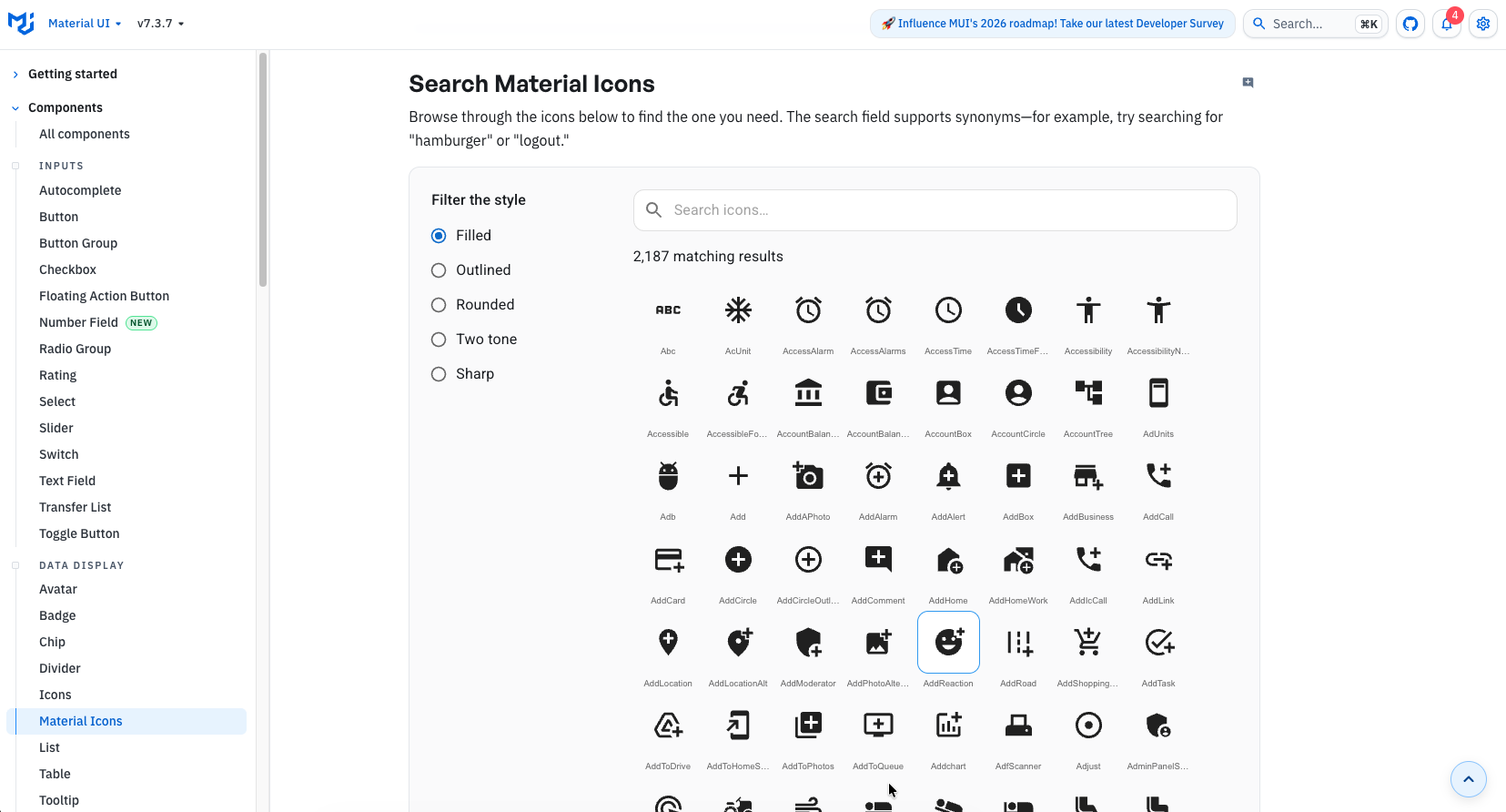
Material UI Icons is the official icon library for Material UI (MUI) and is built around Google’s Material Design guidelines. The icons are provided as prebuilt React components via the MUI SvgIcon system, making them deeply integrated with MUI’s theming, spacing, and accessibility layers.
Rather than being a general-purpose icon system, Material UI Icons are designed to feel native inside MUI components. They inherit color, size, and theme tokens automatically, which reduces manual styling but also tightly couples them to the MUI framework.
Visually, the icons follow Google’s well-known Material Design language. This makes them familiar and predictable, but also means many interfaces using them can look similar.
Key features
- Official icon set maintained by the MUI team
- Based on Google Material Design specifications
- Over 2,000 icons covering common UI actions and patterns
- Exposed as React components using the SvgIcon abstraction
- Automatically inherits MUI theme colors and sizing
- Strong accessibility defaults built into MUI
7. Phosphor Icons
![]() Phosphor Icons is a free and open-source icon family for interfaces, diagrams, presentations.
Phosphor Icons is a free and open-source icon family for interfaces, diagrams, presentations.
Designed by Helena Zhang and Tobias Fried, the library offers more than 9,000 icons overall, distributed across six styles: Thin, Light, Regular, Bold, Fill, and Duotone, with approximately 1,500 icons per style.
Key features
- Around 9,000 icons in total, distributed across six styles
- Each style contains approximately 1,500+ icons
- SVG-based icons with a flexible React API
- Easy control over size, color, and weight via props
- Consistent visual system across all icons
- Open-source and free for personal and commercial use
8. Tabler Icons
![]() A collection of 5,900+ free, MIT-licensed SVG icons, designed for modern web projects.
A collection of 5,900+ free, MIT-licensed SVG icons, designed for modern web projects.
Tabler Icons is a free, open-source icon set.
The library includes 5,900+ MIT-licensed SVG icons, each designed on a 24×24 grid with a 2px stroke.
Key features
- 5,900+ free, MIT-licensed SVG icons
- Consistent 24×24 grid with 2px stroke across the entire set
- Works well with React, Vue, Svelte, and plain HTML/CSS
- Easy to customize size, color, and stroke via SVG or CSS
- Actively maintained and community-driven on GitHub
Final Thoughts
In 2026, icons are no longer a small UI detail. They are part of a product’s visual identity and directly influence how modern interfaces feel, especially in SaaS, dashboards, and AI-driven products where users scan more than they read.
A good React icon library should:
- Scale cleanly with your codebase
- Stay visually consistent as the product evolves
- Offer beautiful, well-crafted icons that elevate UI quality
- Follow an up-to-date design language rather than legacy patterns
- Support tree-shaking and TypeScript out of the box
- Fit naturally into a real design system, not just a component demo
As interfaces become easier to generate and more standardized, design quality becomes the moat. Thoughtful iconography helps products feel intentional, premium, and trustworthy instead of generic or auto-generated.
Choose a library that aligns with how your product is built today and how it will grow tomorrow. For teams that care about modern UI quality, consistency, and long-term maintainability, this decision matters more than ever.
Related Posts
How to use SVGs in React: a Complete Guideline
SVGs are internet's favorite way of using images nowadays. Be it icons, illustrations, UI elements, or just plain images; SVGs or Scalable Vector...